1.LECTURES
Week 1/
1.1Offline lecture: Introduction & Briefing
Mr. Max explained the classroom rules to us in detail and patiently
showed us how to write our reflections in our e-portfolio.In this
lecture, I learned how to create my e-portfolio and clarified the
learning tasks for the next two weeks.
1. 2Pre-recorded lectures
This lecture is roughly divided into three parts: "The Development
History of Typography", "How to Learn Typography", and "What is
Typography". It provides a detailed introduction to this course and enables me to
understand the meanings of common technical terms in this course,
laying a necessary foundation for the subsequent study of the
course.
Typography : art and technique of arranging type[ to make written language
legible, readable, appealing when displayed ]. ' The style and
appearance of printed matter.'
Font : a font refers to the individual font or weight within the
typeface, l.e.: A , A , A
Typeface : a typeface refers to the entire family of fonts/weight
that share similar characteristics/styles, l.e.: A , A , A
How to learn Typography : Practice, Observation, Senior,
Reading (plentiful)
Week 2/ Typo_3_Text_Part 1
1.Tracking: Kerning and Letterspacing
-
Kerning: The automatic adjustment of space between letters
-
Letterspacing: add space between the letters
-
Tracking: The addition and removal of space in a word or sentence.
Normal tracking, Loose tracking and Tight tracking
Figure 1.1.1 Reference images of different tracking
"Uppercase letterforms are drawn to be able to stand on their own, but
lowercase letterforms required the counterform."
Counterform: The black space between the white
Figure1.1.2 Counterform
2.Formatting Text
-
Flush left - is the most readable format: This format most closely mirrors the asymmetrical experience of
handwriting.
-
Gray value: Text on white piece
If you half close your eyes and you look at the
gray(text)
>The grayness is too light: that means there is not enough leading(the space between each line of
the text) or you have given kerning
>The grayness is too light: that means you give it too much
letterspacing or you give it too much leading.
-
Centered: This format impose symmetry upon the text, assigning
equal value and weight to both ends of any lines. It is important
to amend line breaks so that the text does not appear too
jagged.
-
Flush right: This format places emphasis on the end of a line as opposed to
its start.
-
Justified: This format imposes a symmetrical shape on the text. Careful
attention to line breaks and hyphenation.
-
When setting the field of type, keep in mind the typographer's first job:clear, appropriate, presentation of the author's message.
Quite simply if you see the type before you see the words, change
the type.
3.Texture
-
It is important to understand how different typefaces feel as
text.
-
Consider the different textures of these typefaces: Type with a
relatively generous x-height or relatively heavy stroke width
produces a darker mass on the page than type with a relatively
smaller x-height or lighter stroker.
4.Leading and Line Length
- you have to consider readers.
-
The goal in setting text is to allow for easy, prolonged
reading.
-
Type size: Text type should be large enough to be read
easily at arms length
-
Leading: Text that is set too tightly encourages vertical
eye movement
-
Line Length: Appropriate leading for text is as much a
function of the line length as it is a question of type size and
leading. A good rule of thumb is to keep line length between
55-65 characters.
Type Specimen Book
-
A type specimen book shows sample of typefaces in various
different sizes.
-
A Type specimen book (or ebook for screen) is to provide an
accurate reference for type, type size, type leading, type line
length etc.
-
Compositional requirement: Text should created a field
that can occupy a page or a screen.
Week 3/ Typo_4_Text_Part2
Indication Paragraphs
-
There are several options for indicating paragraphs:
'pilcrow' (¶): a holdover from medieval manuscripts seldom use today.
'Pilcrow' was used in set index to indicate paragraph spacing,
instead of creating paragraph space, they use a few code to
indicate paragraph space.
'Line space'(leading*): It be displayed between the
paragraphs.
the line space and the paragraph space are the same. This
ensures cross-alignment across columns of text.
ideally: leading is 2.5pt (2pt~3pt) larger than typeface point size.
-
What is the difference between line spacing and leading:
Line spacing: Line spacing takes into consideration the
baseline of one sentence to the decender line of the other sentence.
Leading: The space between two sentences.
The standard indentation, the indent is the same size of the line
spacing or the same as the point size of your text.
Widows and Orphans
-
Designers must take great care to avoid the occurrence of the
above mention:
A widow: A widow is a short line of type left alone at the
end of a column of text.
An orphan: An orphan is a short line of type left alone at
the start of new column.
Solution:
A widow: The only solution to widows is to rebreak your line
endings through out your paragraph so that the last line of any
paragraph is not noticeably short.
An orphan: Careful typographers make sure that no column of
text starts with the line of the preceding paragraph.
Highlighting Text
Some simple examples of how to highlight text within a column of
text:
-
Different kinds of emphasis require different kinds of contrast.
- Change the typeface(Bold or sentence bold)
-
Change the color of the highlight text:black, magenta,(yellow
would be not readable)
Example: To ensure visual cohesion of the text. The sans serif
font (univers) has been reduced by 0.5 to match the x-height of the
serif typeface.
When highlighting text by placing a field of color at the back of
the text, maintain the left reading axis of the text ensures
readability is at this best.
Quotation marks: like bullets, can create a clear indent,
breaking the left reading axis.
Prime: A prime is not a quote. The prime is an abbreviation
for inches and feet.
- single prime: a feet
- double prime: inches
Heading within Text
Hierarchy: A,B,C (according to the level of important)
- to make sure these heads clearly signify to the reader the
relative importance within the text and to their relationship to
each other.
-
A: 'A' heads are set larger than the text, in small caps and bold.
-
B: The B head here is subordinate to A heads. B heads indicate a
new supporting argument or example for the topic at hand.
-
C: Highlights specific facets of material within B head text.
Week 4/ Typo_2_Basic
Describing Letterforms
Terms concerning the components of letterforms:
It is helpful to identify specific typefaces
(lexicon is another word for terminology)
The font
A type family has many typefaces.
Choose a type family that has a good range of typefaces.
-
Small Capitals(small caps)
When you are using an acronym (when there are too many acronym in
your body text): There are typeset in uppercase letters and it is
gonna stick out. You can choose small capitals when it comes to
these kind of circumstances.
If the type family doesn't have a small capitals, you can't force
them become small capitals seem to have a teener weight.
-
Uppercase Numerals (lining figures): They are
most successful used with tabular material or in any
situation that calls for uppercase letter.
[You can use them, if they have them.]
-
Lowercase Numerals (old style figures or text figures): They are best used when ever you would use upper and
lowercase letterforms.
-
Italic: Most fonts today are produced with a matching
italic. Oblique are typically based on the roman form of the
typeface.
-
Punctuation, Miscellaneous characters: Although all fonts contain standard punctuation
marks, miscellaneous characters can change from typeface to
typeface.
-
Ornaments: Used as flourishes in invitations or
certificates.
Describing Typefaces
-
Keep in mind that some, all, or combinations of these styles
may be found within one type family:
-
Roman & Italic
-
Boldface & Light
-
Condense & Extended
-
People who rendered the 10 typefaces all sought to achieve two goals: Easy readability and an appropriate expression
of contemporary esthetics.
-
Beyond the gross differences in x-height, the forms
display a wealth of variety, in line weight, relative
stroke width and in feeling(can't use and expression)
2.INSTRUCTIONS
Figure 2.1 Module Information Booklet (MIB) of Typography
3.
PROCESS WORK
-
Task 1: Exercise 1_Type expression
In Exercise 1, we picked four words in class to make type expressions
with: jump, melt, roll, and chill. We are not encouraged to use too
many graphical elements and any colors, but black, white, and gray are allowed.
1. Research
I realized that what I need to do is to achieve the goal of concretely
expressing the meaning of a word by carefully considering and adjusting
the font, typeface, and spacing of each letter in that word. Meanwhile. I need to expand my thinking by looking up words with
similar meanings
I began to look up reference images for my draft using Pintrest.
The words we chose in lecture are ‘jump', 'melt', 'roll' and chill'
respectively:
Figure 3.1.1 Reference for the word 'jump'
Figure 3.1.2 Reference for the word 'melt'
Figure 3.1.3 Reference for the word 'roll'
Figure 3.1.4 Reference for the word 'chill'
2. Ideation
Figure 3.2.1 Sketches for the word"jump"
Idea 1:What first came to my mind was to enable readers to intuitively feel
the action of "jumping" when they see this font design. So I tried to
combine the four letters in the word "jump" to form the image of a
person who is jumping, and added some small graphics to suggest the
image and action of the character
Figure 3.2.2 Reference (jump)
Idea 2:During the process of searching for references, I saw that some
designers manifested the dynamic sense of the word by superimposing the
outline shapes of the letters. This gave me a new idea. Considering that
I couldn't use colors in this task, I attempted to achieve a similar
effect by superimposing gradient lines from black to gray on each
letter, and tried to imply the sense of jumping by changing the
letterforms of each letter.
Figure 3.2.3 Reference (jump)
Idea 3:Based on the previous two ideas, I tried to represent the word "jump"
through the letterforms themselves. At the same time, I combined with
Idea 1 and added some small patterns beside the font, hoping to express
"jump" by means of the images of a jumping animal.
Idea 4:I came across some interesting designs on the Xiaohongshu platform. It
occurred to me that an asymmetrical layout might be able to showcase the
dynamic feel of the word. Therefore, I elongated the overall letterforms
of the word and adjusted the positions of the four letters individually.
Additionally, I attempted to make the font appear dynamic by placing
black squares in a staggered pattern within each letter
-
Idea 5:After getting Mr. Max's suggestions, I realized
that I had used too many graphics in the first, third, and fourth
ideas. The shortcoming of the second idea is that it failed to
well convey the action of jumping. So I started making some new attempts
I got inspired by a picture on Pinterest. There is an arc added below
the word in the picture, which reminded me of "rope skipping".
Figure 3.2.4 Reference (jump)
So I adjusted the positional relationship of each letter in the word
"jump" and incorporated this new idea.
Figure 3.2.5 Sketches for the word"jump"
Figure 3.2.6 Sketches for the word"melt"
Idea 1:The word "melt" can not only mean the transformation of an object from
a solid state to a liquid state, but also imply "softening an object".
At first, I intended to embody "a soft object" through an appropriate
font shape. After drawing a suitable font, I combined the image of "a
melting popsicle" on this basis to integrate the two related meanings of
the word "melt", hoping to enable readers to more clearly understand the
meaning of this word.
Figure 3.2.7 Reference (melt)
Idea 2:I tried to visually represent the most common meaning of "melt" in a
simple way. So I demonstrated the melting process of an object gradually
changing from a solid state to a liquid state through the different
degrees of melting of the four letters
Idea 3:This is similar to the second idea about "melt". I got inspiration from
a picture of letters composed of water stains. I adjusted the
perspective of the four letters and intended to express "melt" by having
the letters gradually slide off the table and turn into liquid as they
melt.
Figure 3.2.8 Reference (melt)
Idea4:After looking at many common and intuitive design works, I saw a donut
with icing on it. Combining with many works that express "melt" which I
had seen before, I came up with a new idea. In order to make this design
more legible, I added two arcs to depict the donut, hoping to set off
the font in this way.
Figure 3.2.9 Reference (melt)
Figure 3.2.10 Reference (melt)
Regarding "roll", I came up with two design directions.
-
What first came to my mind was "reel".
Idea 1:I
added letters based on the image of the rolled-up object.
Idea 2:I embodied "reel" by choosing an appropriate typeface and making
use of the letters themselves. I hope that in this way, readers
can intuitively visualize 'roll'.
Figure 3.2.11 Sketches for word "roll"
-
After the first two ideas, I thought of "wheel"
again.
Idea 3:I tried a simpler and more intuitive approach. I adjusted the
inclination of each letter and changed the position of the letter
"o", and it seems that I achieved a good result.
Idea 4:I referred to the image of "wheel" and tried to emphasize the
meaning of "roll" in this way.
Figure 3.2.12 Sketches for word "roll"
Figure 3.2.13 Sketches for word "chill
Idea 1:What first came to my mind was the word with a similar
meaning, "cold". So I made some changes to the typeface of
"chill" so that they can convey the feeling of
coldness.
Figure 3.2.14 Reference (chill)
Idea 2:I changed the letterforms so that they could indirectly
remind the readers of a sofa or a person leaning back on a
sofa in a relaxed manner, and I tried to convey a sense of
ease in a simple way.
Idea 3:I thought of one of the meanings of the word "chill", which
is "frightening". I combined the five letters into an image
resembling a "monster" by changing the positions of the
letters.
Idea 4:I combined the word with some graphics and tried to express
a "sense of relaxation" by presenting a vacation scene, so
as to embody the meaning of "chill"
Figure 3.2.15 Sketches for four words (jump, melt. roll, chill)
3. Final Outcome
Finally, I selected four drafts out of the sixteen and digitized
them.
Figure 3.3.1 Final type expression "jump, melt, roll, chill"
(JPG)
Figure 3.3.1 Final type expression "jump, melt, roll, chill" (PDF)
Animation:I chose the word "melt" and made it into an
animation because I thought it could better demonstrate the melting
process and express the word "melt" more vividly:
Animation 3.3.2 Final outcome
-
Task 1: Exercise 2_Text Formatting
In exercise 2, we learn and work with kerning and tracking. After that,
we need to create a final layout for text formatting.
1. Kerning and tracking exercise
We need to work with kerning and tracking our names using the ten
typefaces that were provided and we are allowed to use different fonts
and type sizes in a typeface.
Fig.2.1 Text formatting with and without kerning
Fig.2.2 Both with kerning and without kerning overlapped to see the
differences
2.Layout Exercise
We need to create a
final layout and work with the text formatting. The purpose of this exercise is to help us better understand text
formatting and, through practice, experience the details we need to pay
attention to in the process.
2.1 Research: Layout Reference
Fig 2.1.1 Layout Reference
2.2 Ideation: Sketches for layout
After looking up some references, I tried to express my ideas directly
using Id.
Fig 2.2.1 Sketches For Layout, (week 5)
-
On page 4, I tried body text with a font size of 10 pt.
-
On page 7, due to different layout attempts, I made small adjustments
to the number of words per line in paragraphs 3 to 4.
-
Except for that, the body text in all digitized drafts is consistent
in line spacing, font size, etc., with differences only in title font
size, letter spacing, and other aspects.
HEAD LINE
Typeface - Bembo Std
Font/s: -Bembo Std Bold, Extra Bold,
Semibold,
Type Size/s ( Page1-8 ): 36 pt, 12 pt; 72 pt, 22 pt; 48 pt, 24 pt; 60 pt, 24 pt; 28 pt, 24 pt; 60
pt, 18 pt; 60 pt, 36 pt; 72 pt, 36 pt.
Leading - 36 pt, 48 pt, 30 pt, 60 pt, 26 pt, 58 pt, 29 pt, 72 pt, 22
pt, 43 pt, 86 pt.
Paragraph spacing - 0
BODY
Typeface - Bembo Std
Font/s - Bembo Std
Type Size/s - 9
pt, 10 pt
Leading - 11 pt
Paragraph spacing - 11 pt
Characters
per-line - 55 -65/ 50 - 60/ 35 - 45( Page 7, Paragraphs 3-4 )
Alignment
- left justified
Margins:
Page 1: 123 mm top, 26 mm left + right + bottom
Page 2: 25 mm top, 15 mm left,45 mm right, 25 mm bottom
Page 3: 25 mm top, 16 mm left + right, 25 mm bottom
Page 4: 25 mm top, 16 mm left + right, 25 mm bottom
Page 5: 140 mm top, 22 mm left + right, 25 mm bottom
Page 6: 140 mm top, 22 mm left + right, 25 mm bottom
Page 7: 65 mm top, 20 mm left, 50 mm right, 24 mm bottom
Page 8: 60 mm top, 50 mm left, 15 mm right, 20 mm bottom
Columns - 2, 1
Gutter - 10 mm, 9 mm, 11 mm
2.3 Final Outcome
After the feedback session in the week 5 class, The draft on page three was selected as the final result.
2.3.1 GPEG: With Grid Visible and Without
Fig 2.3.1.1 Final Text Formatting (with grids) - GPEG, week 5
Fig 2.3.1.2 Final Text Formatting (without grids) - GPEG, week5
2.3.2 PDF: With Grid Visible and Without
<iframe
src="https://drive.google.com/file/d/1pIcIs-CiZJQ1WckjCJdItKbPhot5BeZ0/preview"
width="640" height="480" allow="autoplay"></iframe>
Fig 2.3.2.1 Final Text Formatting (with grids) - PDF, week 5
<iframe
src="https://drive.google.com/file/d/19gdoKTHYg5isMCpqa8UBDy6hMr_ghz2Y/preview"
width="640" height="480" allow="autoplay"></iframe>
Fig 2.3.2.2 Final Text Formatting (without grids) - PDF, week 5
HEAD LINE
Typeface: Bembo Std
Font/s: Bembo Std Bold
Type Size/s:
48 pt
Leading: 57.5 pt
Paragraph spacing: 0
BODY
Typeface: Bembo Std
Font/s: Bembo Std
Type Size/s: 9
pt
Leading: 11 pt
Paragraph spacing: 11 pt
Characters
per-line: 55 - 65
Alignment: left justified
Margins: 25 mm top, 16 mm left + right, 25 mm bottom
Columns: 1
Gutter: 10 mm
5.FEEDBACK
5.1 Type expression
General Feedback: When making font type expressions, based on the design drafts of
different words, there are different ways to improve them. Most of them
are good, and only a part needs more attempts.
Specific Feedback: For the drafts of 'jump', except for the second one, all use more
graphical elements than the allowed number. And none of these four
drafts well express the word 'jump' in a non-animated state.
General Feedback: Some drafts use more image elements than the acceptable number, but
most of them are good. After the changes, each word's design draft has one or two good ones
that can be digitized.
Specific Feedback: Good, no problem here.
General Feedback: The appearance of some digitized outcomes can still be improved
further, but the overall effect is fine.
Specific Feedback: In the digitized outcome of "melt", the gap formed by the melting
letter "e" doesn’t have to be a standard geometric shape—irregular
shapes can boost the visual effect. For the word "roll", changing the
font from the serifed 'Bodoni Std' to the sans-serif 'Futura Std' can
further improve its visual appeal.
-
General self-reflection for type expression
Sketch
1. Are the explorations sufficient? √
2. Does the expression match
the meaning of the word? √
3. On a scale of 1–5, how strong is the
idea? (also check on the marking criteria)
4. How can the work be
improved? √
Digitisation
1. Is the exploration sufficient? √
2.
Does the expression match the meaning of the word? √
3. Is the
expression well crafted (crafting/lines/shapes)? √
3a. Does it
sit well on the art-board √
3b. Is the composition engaging?
Impactful? √
4. How can the work be improved? √
5.2 Text-Formatting
Week 6
General Feedback: The body text, the arrangement, the requirement for
the formatting details are all ok. But in most pages, the basic space distribution doesn't look
balanced.
Specific Feedback: In most design layouts, the space arrangement on the left and right
sides doesn't look comfortable.In the layout, some parts aren't necessary, and others stand out
too much. Compared to other pages, page 3 is a better choice.
6.REFLECTION
The five-week course wasn’t easy for me. I always worried my ideas and
work weren’t good enough, so I spent a lot of time on drafts and
digitizing steps. Luckily, the instructors were really responsible and
patient—whenever I had questions, they helped me find answers. Even
though keeping up with the course and finishing tasks thoroughly was
tough, I felt fulfilled and happy throughout these five weeks. I learned
so many practical things, expanded my knowledge, and gained a deeper
understanding of Typography. It was really meaningful!
In class, I noticed my understanding of the course was constantly
changing. My view of Typography was guided in the right direction—I
started focusing less on small details and more on the big picture.
Also, when completing tasks, my steps and goals became more
specific.
Typography is a practical art. When designers work, they need to think
about both visual/artistic effects and readability/coordination. Every
part of a design should work together, not alone or separately. Good
typography is both beautiful and useful. I realized I always spend too much time on every step of tasks but not
efficiently. That means things often get done at the last minute. I need
to improve my time management and work efficiency, and focus more on the
overall feel and coordination when finishing work. Also, reviewing and
summarizing after class are really important—they’re the basis for
making sure I work efficiently.
7.FURTHER READING
This book helps designers tackle the fundamental challenge of arranging
text on blank pages and screens through a concise and easy-to-understand
approach. It also explains the development of printed fonts and offers
practicality across various visual communication media. I chose to read
its first chapter, "letter"
Most of the time, designers use existing large font libraries to
select and combine fonts based on needs, and in this case, sufficient
wisdom and skill are indispensable. Sometimes, they also design and
customize fonts themselves.
Two images about the basic knowledge of letter
-
I already knew some of the knowledge covered in the "text"
chapter from my courses. Reading this chapter has enriched and
expanded my knowledge, giving me a deeper understanding of what
I learned in school. Below are some interesting parts I
noted:
Monster Fonts: For traditional printed fonts at the time, this typeface was a
pioneering attempt. Its stroke weights, letter serifs, etc., all
reflected its novel structural features. Meanwhile, in that era,
this typeface provided vitality for the rapid development of the
advertising industry.
An image about Monster Fonts
Type As Program:In 1967, with the rapid development of electronic communication technology, a
typeface designed to improve visual effects on screens and for
programmatic typesetting was created.
Two images about ' type as program '
Type As Narrative: With digital tools continuously supporting media, typefaces that had
pursued perfection for centuries began to change in the opposite
direction of previous pursuits. Fonts like "Template Gothic" and "Dead
History" emerged accordingly.
Two images about ' type as narrative '


.jpeg)

.png)

.png)


.jpeg)


.jpeg)


.png) Fig.2.1 Text formatting with and without kerning
Fig.2.1 Text formatting with and without kerning
 Fig.2.2 Both with kerning and without kerning overlapped to see the
differences
Fig.2.2 Both with kerning and without kerning overlapped to see the
differences

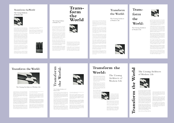 Fig 2.2.1 Sketches For Layout, (week 5)

.jpg) Fig 2.3.1.1 Final Text Formatting (with grids) - GPEG, week 5
Fig 2.3.1.1 Final Text Formatting (with grids) - GPEG, week 5
.jpg)
.jpg)


Comments
Post a Comment